
Last week, we introduced you to the art and science of infographics. These visuals communicate complex information in its most distilled form, which makes them often the most understood form. From a stop sign to a flow chart, valuable information is relayed to the viewer in these graphics. Where newspapers told the story in the headline and caption, modern communication is more and more relying on these graphics to relay hundreds of pieces of information within the timeframe it takes you to glance at it.
This week, we present you with infographics about the most critical issue – climate change. It’s easy to make a hard topic like climate change too complex to understand. What’s difficult is to make it easy to understand. This is where infographics can do the talking and very effectively so.
We start with one of the most well known and reputable infographics of our time – the Keeling Curve. Developed right here in San Diego by Scripps Institute of Oceanography’s Professor Charles Keeling in 1958, he started collecting the data shown in this curve and created the basis to project the increase in carbon dioxide (CO2). So important is this curve that if you flew across the country to Washington D.C. and walked into National Academy of Sciences, there you would see the same curve carved into its wall. Keeling’s son Ralph who works as the CO2 Director also at the Scripps Institute of Oceanography continues his work today.
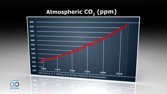
The Keeling Curve (Credit: Climate Central)
What is CO2 and why track it? Well, CO2 comes from a variety of natural sources and human-related emissions. Since the Industrial Revolution when we started powering our lifestyles on the combustion of fossil fuels, we’ve contributed more CO2 to the environment than it can absorb. This extra CO2 along with other gases are trapping heat in the atmosphere and that is causing the climate to change.
The Keeling Curve is important for many reasons: it shows where we were at the time the curve was developed. It shows us where we were headed. It shows us how quickly we would get to where we were headed. It introduced us to an important number – the number 400. And within its graph, its red lines show annual spikes and dips of CO2 levels, as well as the continuous upward trajectory.
We estimate that you can look at the Keeling Curve and within seconds start to understand and gain the benefit of over a half a century of research. Within that graphic, daily measurements of atmospheric CO2 concentrations from the Mauna Loa Observatory on the Big Island of Hawaii are communicated to you.
You might ask, why Mauna Loa? The answer is many reasons. Keeling found the upper-north face of the Mauna Loa volcano to be the perfect location to track the atmosphere’s CO2 levels. It’s isolated location was free from human activity like factories and vegetation like forests that could influence the readings. And its sampling location is normally upwind of the volcano’s vent. This allowed it to take the most accurate samples from incoming clean breezes directly from the ocean. Keeling also perfected methods for detecting and correcting intervals with the wind blew the wrong way.
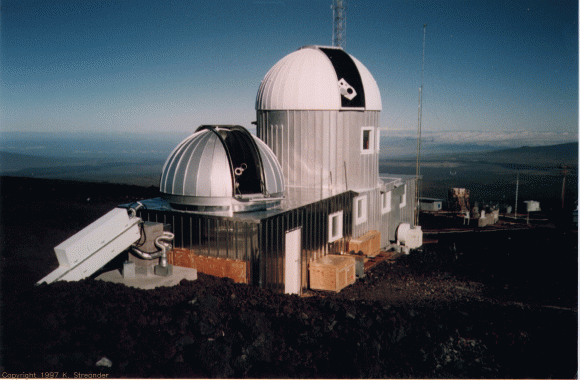
The Mauna Loa Observatory
(Credit: Global High-Resolution H-alpha Network)
Keeling spent his lifetime developing the data that the Keeling Curve allows all of us to see and know in moments. We thank him for his efforts and we thank this graphic for showing us our starting point, as well as our trajectory. We share many things and one of them is the environment we live in. The Keeling Curve gives us a better opportunity to know what is happening with that environment.
Next up, more about that number, 400.
The Collaborative Services Blog Team
![]()
![]()
Recent Comments