
Because they just are. It is important to be clear about what your main idea is when communicating, because your audience has limited time and is bombarded daily with information. So, you need to make sure that you grab their attention. And, once you have it, make sure to deliver the most important idea you want to convey. If they get interrupted or distracted, which is pretty easy to do these days, then you want to make sure that you got your point across. Not only that, you want to have engaged them so thoroughly that they must view the rest of your communication.
Once you figure out what your most important idea is, make the copy and/or art for this main idea the most prominent element on the page. One way to do this is to represent the main idea with the largest copy and/or art on the page. Or, you can use color. For example, representing the main idea with the brightest copy and/or art on the page will make it the most noticeable. Or, if you surround the main copy and/or art with a large amount of white space, it will stand out. This technique can also be used in the reverse such as a large black background with the art and/or copy in white. For added effect, you can also use these techniques in combination.
The supporting copy and/or art to that which expresses your main idea should be just that, subordinate. They should never, ever compete with the main focus of your communication or you will confuse your audience and lose their attention.
Here are two examples – one that clearly communicates what the main idea is and another where the main idea is not clear. The examples below clarify this point proving that it is okay for some things to be more important than others.
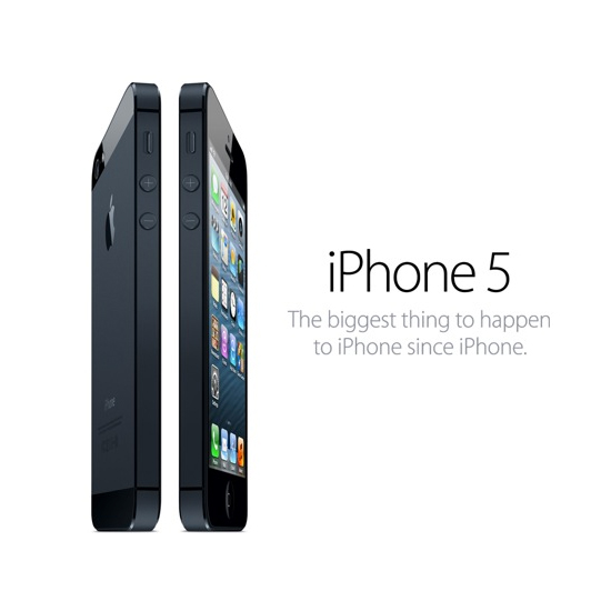
Credit: Apple Inc.
Lots of white space in this ad makes the large art and copy elements stand out. The art and copy on the page are the name of the phone and an image of the phone. It’s hard to miss the point here – we want you to see the new version of the phone that you already have. We think the one you already have is the best phone out there, except for the new version of it. So, go get the new one.
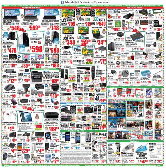
Credit: Fry’s Electronics
The ad above is crammed full of photos and copy – not sure what is important here. We’re not even sure who is addressing the audience until one sees a very small web address for Fry’s Electronics at the top of the page. Once your audience is confused by your communication you have lost them. This is different then being provocative or intriguing which is often used as a technique to peak the audience’s interest.
Making ads simple and clear helps focus the audience’s attention. By using an obvious hierarchy that distinguishes the most important information from the less important information your communications will stand out in a crowded media market and in a world full of visual distractions.
In our next posting, the visual communications tip will address why the use of clip art and stock photography should be avoided.
Laura Warner, President & Steve Luoma, Art Director
Warner Architecture & Design
Recent Comments